
The Secret to Mixing Pattern & Color Like A Designer
Walk into any beautifully designed room and you'll feel it before you can explain it: a sense of harmony that somehow holds together despite the patterns, the bold paint, and the layered textures. It looks effortless, but it isn’t. The rules we follow as designers are learnable, and once you know them, you'll never look at a room the same way again.
The biggest secret to successfully mixing color and pattern is all about intention. We’re here to share how.
Start With A Color Story
Before you pick a single pattern, establish your color palette. Designers typically work with three to five colors: one dominant, one secondary, and one or two accents. It’s a lot like a wardrobe where everything needs to work well together before you start adding prints.
Pull your palette from something you already love. A piece of art, a rug, even a favorite throw pillow. That object becomes your room’s anchor. Every pattern and color you introduce from that point should borrow at least one hue from that anchor. This is what helps creates cohesion without monotony.
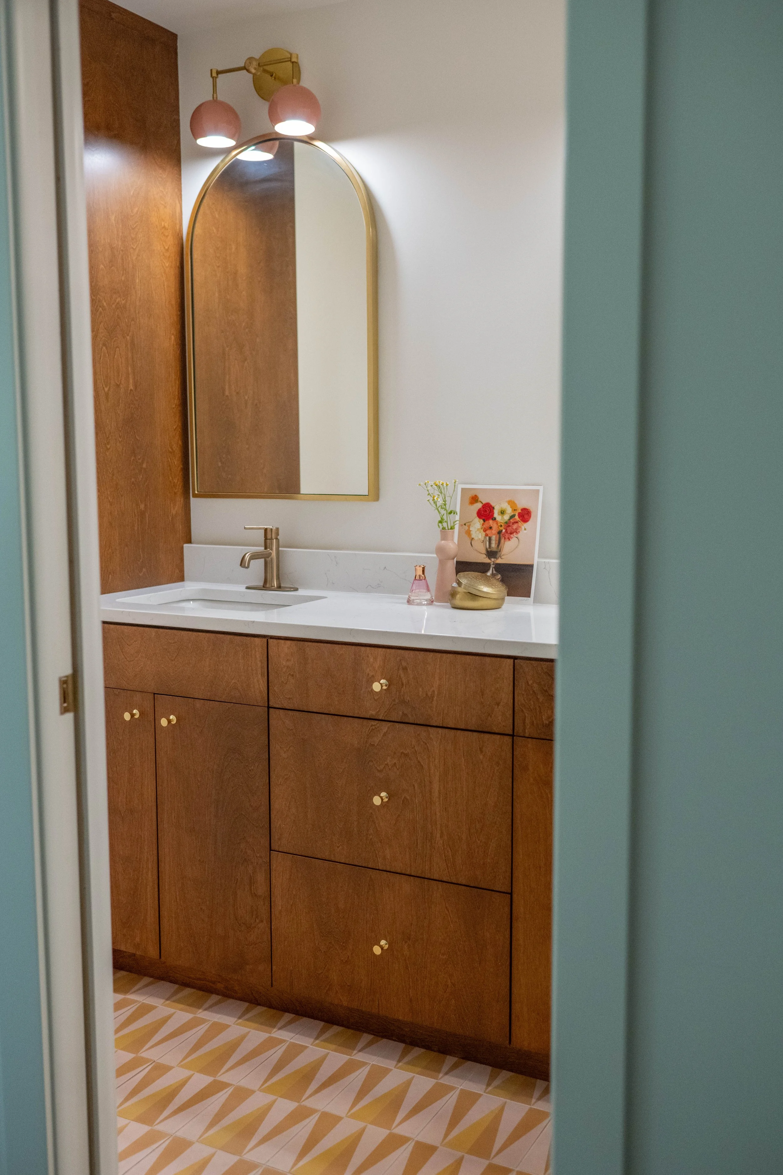
And don't forget your neutrals. White, cream, warm gray, and natural wood tones give a space visual breathing room. They’re essential, not boring.
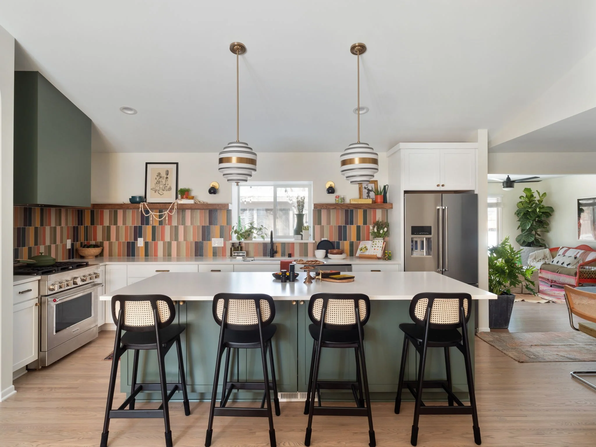
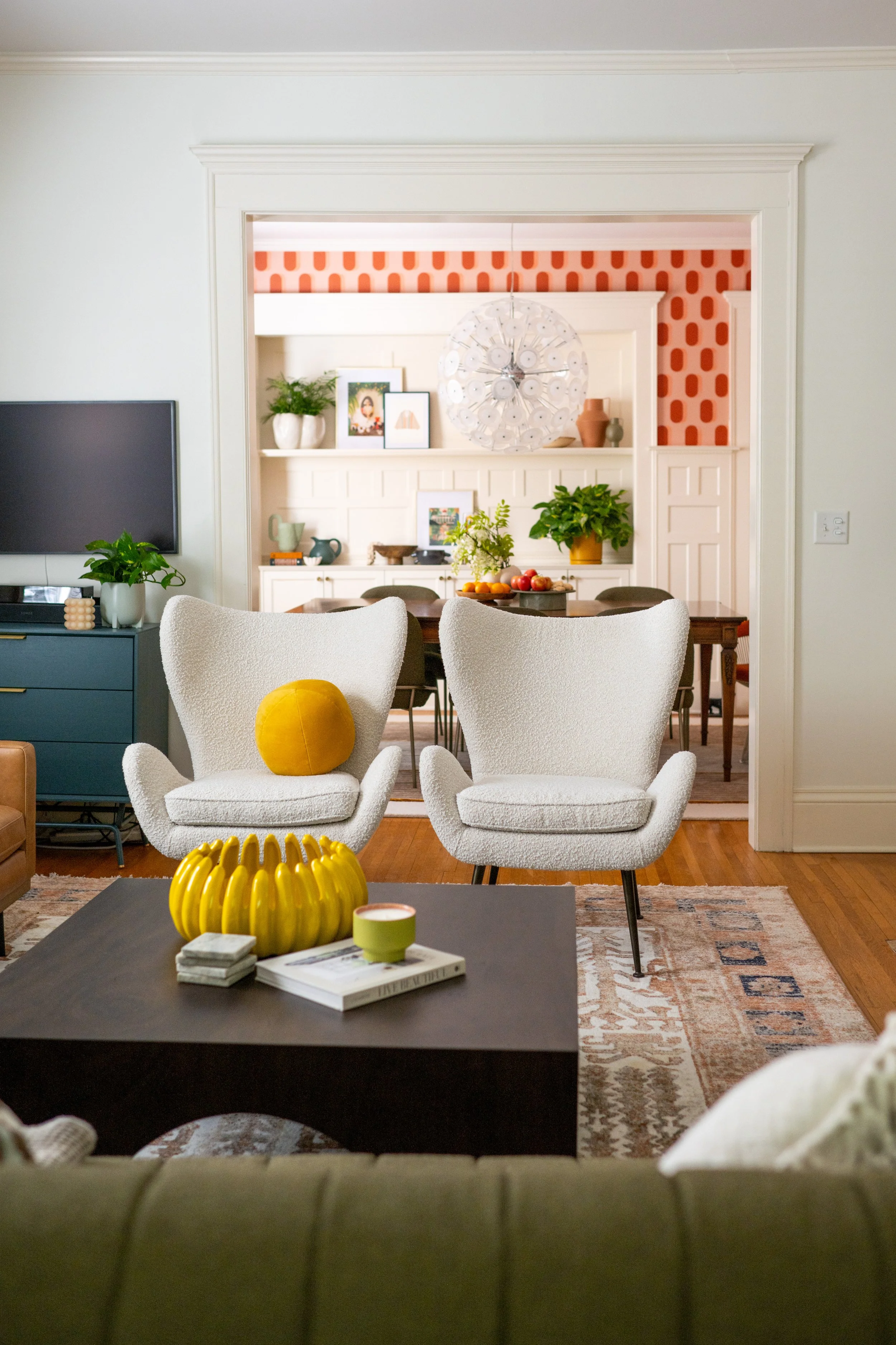
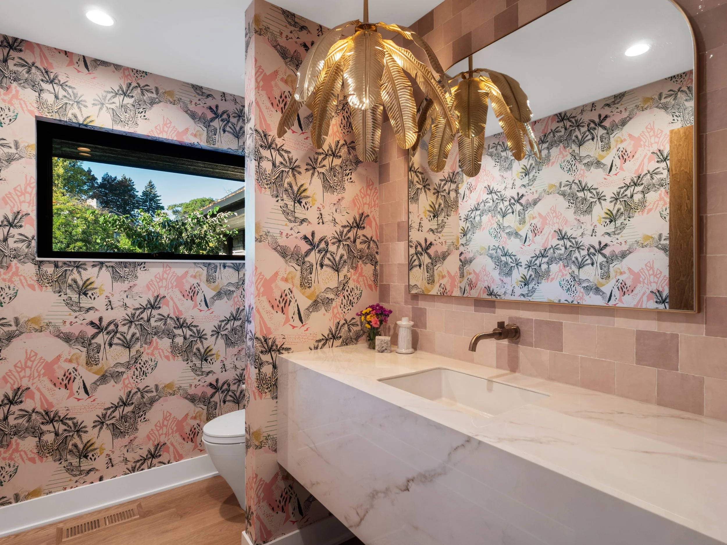
The Rule of Three Scales
The most reliable pattern-mixing trick in any designer's toolkit is varying the scale of your prints. Choose one large-scale pattern, one medium, and one small. That's it.
Large-scale patterns (think an oversized botanical or a wide-stripe) make a statement and anchor the space. Medium-scale patterns (a classic check, a geometric tile, a simple block print) add rhythm. Small-scale patterns, like a subtle texture, bring in detail without competing with the others.
When all three scales live in the same color family, even wildly different patterns feel intentional together.
Contrast Is Your Friend
A common mistake people make is playing it too safe by choosing patterns that are so similar they read as noise. If your sofa fabric is a soft geometric, pair it with something that has real movement: a bold stripe on the curtains, a floral print on the accent chair.
The same logic applies to color. If your walls are a moody navy, bring in a warm terracotta or brass to create contrast. Contrast is what gives a room energy and without it, even a well-curated space can feel flat.
Let One Thing Lead
In any great pattern mix, one element should be the shining star. It might be a show-stopping wallpaper, a hand-knotted rug with an intricate design, or a sofa upholstered in a bold print. Everything else in the room should support that standout piece rather than upstage it.
If your rug is the star, keep your sofa in a solid or subtle texture. Let the pillows echo the rug's colors without mimicking its pattern. This visual hierarchy is what separates a designed room from a decorated one.
Color Temperature Matters
Warm colors (reds, oranges, yellows, warm whites) and cool colors (blues, greens, grays, lavenders) don't always play well together unless you're deliberate about balance. A room full of cool patterns can feel sterile and a room full of warm ones can feel claustrophobic.
The sweet spot is usually a dominant temperature with an accent of the other. A largely cool palette warmed up with brass fixtures and a rust-toned throw. A warm, earthy room cooled down with a sage linen or a dusty blue accent wall.
Trust The Process (And Yourself)
The design process takes time and, as professional designers, we layer, step back, edit, and try again. Bring samples home. Hold fabrics up to your paint. Live with swatches in different lighting before you commit.
At Fox, we believe great design is for everyone. Whether you're starting from scratch or refreshing a room, these principles will help you mix with confidence and love every inch of the result. And if you need help, we are always here!