
Using Color Psychology in Your Home - Creating Spaces That Feel as Good As They Look
If you’re a follower of our work, you know we’re big fans of color. We believe that color is more than just decoration. It’s a mood booster, a calming force, an energy spark or a cozy hug, depending on how you use it. It’s not just something you see - it’s something you feel.
Color is this quiet, behind-the-scenes player that shapes our experiences. Our brains take one look at a color, and suddenly we’re feeling something - calm, energized, cozy or inspired. Understanding how colors affect your mood means you can design a home that doesn’t just look great, but also feels right.
In this guide, we’re keeping it simple. We’ll break down the basics of color psychology so you can bring the right energy to any room in your home.
What is Color Psychology?
In essence, color psychology is the study of how colors affect our emotions and perceptions. Everyone has their own unique color preferences and associations, but there are some universal psychological reactions, too. In design, this means you can set the mood just by choosing the right shade.
Want a calm bedroom? Maybe a focus-friendly office? Or a kitchen that feels warm and welcoming? It all comes down to choosing the right colors.
How to Use Color Psychology in Your Home
Designing a space with intention starts with one simple question: How do you want it to feel? Do you picture a calm and restful retreat, a lively and energizing workspace, or a warm and inviting gathering place? Once you determine the mood you want, you can use color psychology to steer you in the right direction.
Here are a few guiding principles to help you design with color:
Start with Purpose: Think about what you’ll use the room for - is it for relaxing, working, eating or entertaining?
Know How Colors Make You feel: Blues and greens are calming (great for bedrooms), yellows and reds are energizing (awesome for kitchens) and earthy tones are warm and homey (perfect for living rooms).
Stick with a Cohesive Palette: Pick a few colors that work together and feel true to your style, whether it’s beachy blues, warm neutrals or bold jewel tones.
Mix Light and Dark: Light colors can make a room feel bigger, while dark shades add depth. Use a combination of both for better balance and greater contrast.
Think Beyond Walls: Color isn’t just about paint. You can also incorporate color through decorative accents like rugs, pillows, art and even plants.
How Color Impacts Emotion and Your Home
The theory of color psychology in interior design suggests that colors directly impact our emotions and how we engage with a space. With that in mind, here’s a look at some popular shades and the emotions they often inspire.
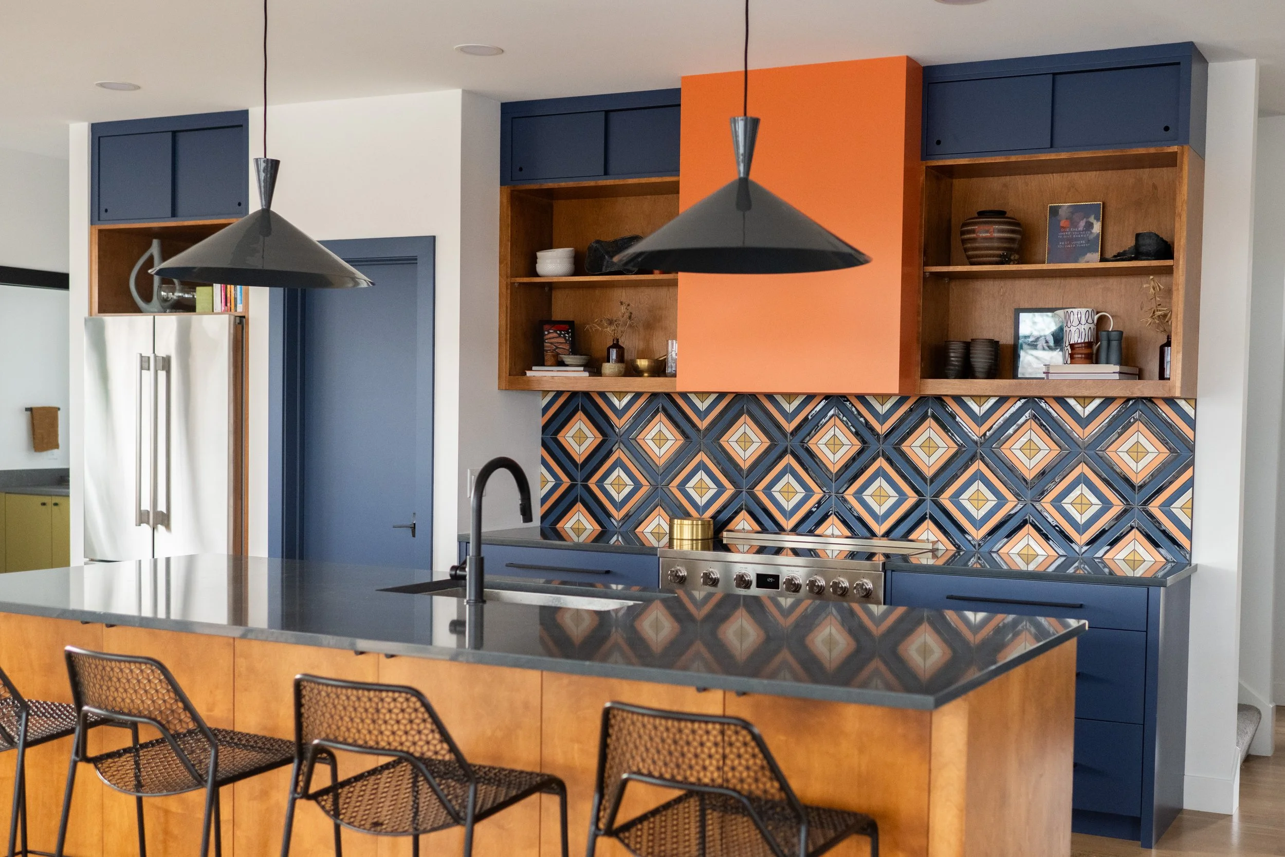
Blue
Blue naturally creates a sense of calm, making it a versatile color for many areas in a home. Softer shades are restorative and peaceful, perfect for bedrooms where rest is essential. Deeper blues can spark clarity and concentration, ideal for productive spaces like a home office. Meanwhile, brighter blues are uplifting, which can be great for rooms where a boost of energy is welcomed (think bathrooms in the morning..). Just remember to use mindfully, since overusing blue can sometimes make a space feel chilly or detached.

Green
Green is all about balance and renewal, bringing a touch of nature indoors. Soft, light greens are soothing and perfect for spaces meant for unwinding. Deeper greens are rejuvenating and can help reduce stress, making them an excellent color choice for living rooms, bathrooms, or even kitchens. Brighter greens add a burst of vitality, but a little goes a long way - too much bright green can feel jarring or overstimulating.

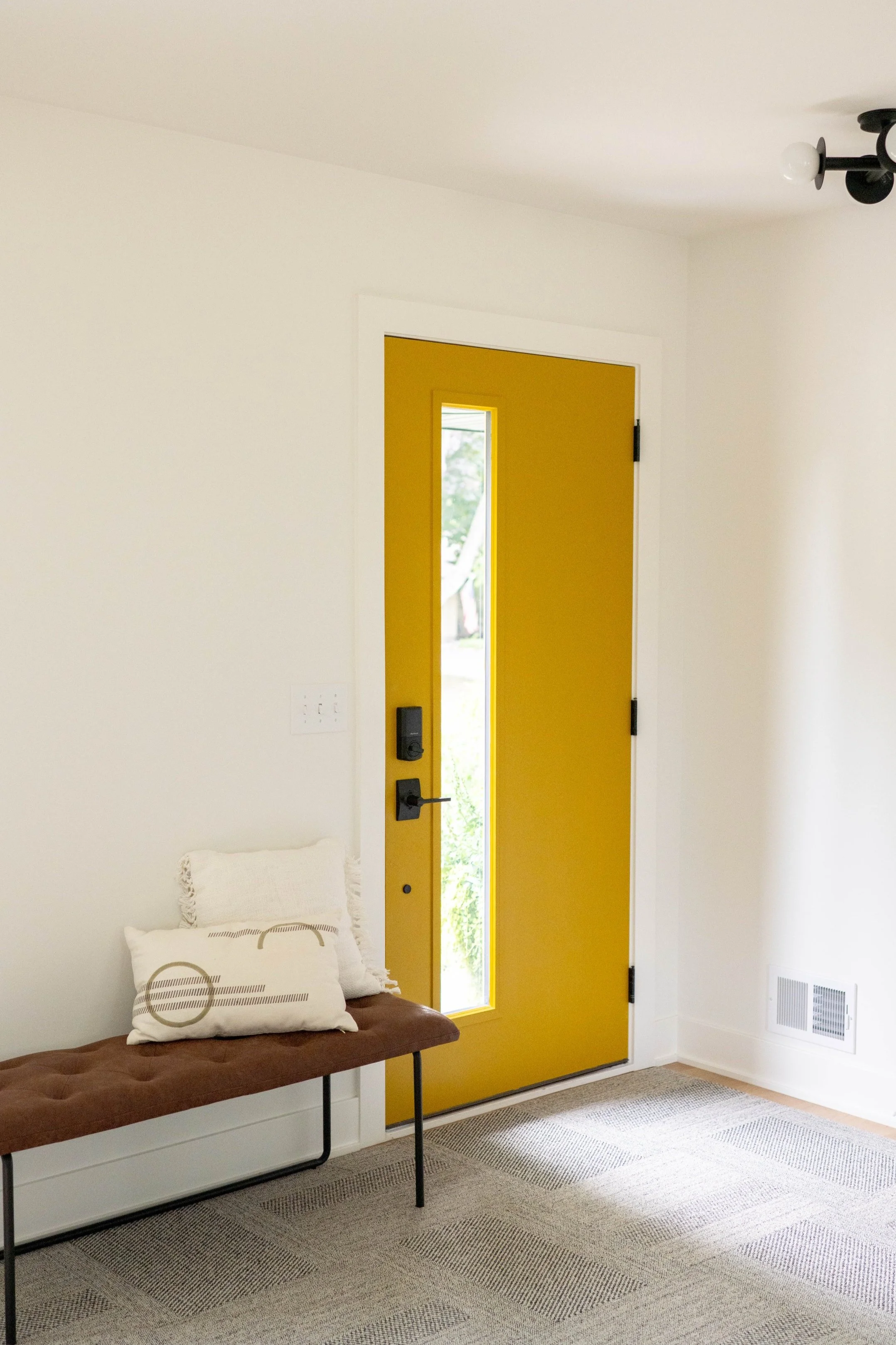
Yellow
Yellow is all about warmth, cheerfulness and positivity, boosting the mood in any room. It’s an excellent color for kitchens, dining areas or creative spaces. Softer shades create a cozy, welcoming ambience, while brighter yellows are imbued with a sense of joy and inspiration. A sprinkle here or there, or a smaller room, is perfect, but too much, especially in a brighter shade, can make you feel like you’re walking into the sun.
Pink
Pink evokes comfort, care and compassion. Soft pinks like blush, rose and dusty pink create a nurturing, cozy feel and can work well as a versatile neutral. Vibrant pinks like magenta and fuchsia pack a vibrant punch and make a bold statement in any room. However, too much soft pink can feel weak, while an overload of bright pink can be harsh or overwhelming.

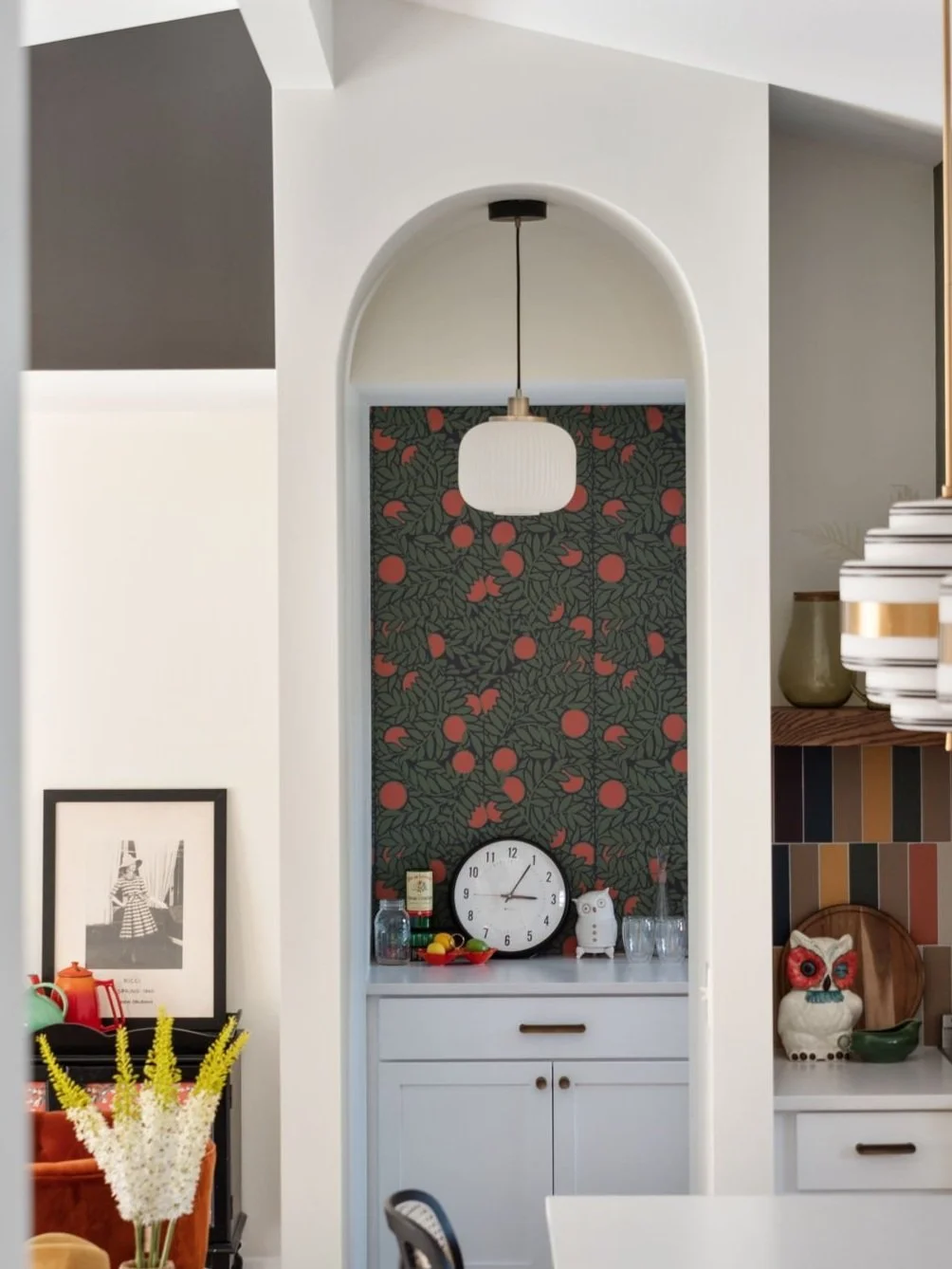
Red
Red is all about intensity - bold, powerful and full of passion. It’s a color that commands attention and stirs emotions, making it great for spaces where you want excitement, intimacy or lively interaction. Deep shades like burgundy add warmth and sophistication, while brighter reds like cherry or scarlet bring a sense of vibrancy. Red works especially well as an accent color in kitchens for an added touch of drama. That said, it's best paired with neutrals to keep it from feeling overly aggressive or even exhausting.
Gray
Gray is a commonly used neutral that brings balance and a modern touch to any room. It works as an elegant backdrop that pairs effortlessly with both warm and cool accents. Light grays can open up spaces, creating an airy feel, while darker grays add depth. Charcoal gray is one of our favorite shades to incorporate into designs because it offers a rich alternative to black, grounding brighter colors without feeling too harsh. Too much gray can feel dull or cold, especially without the warmth of complementary tones.

White
White is the ultimate blank canvas, bringing a sense of freshness, light and simplicity to any room. It creates a feeling of peace and clarity, offering a retreat from visual clutter and emotional noise. Crisp, bright whites feel modern and energizing, while softer, warmer whites create a more intimate atmosphere. However, too much white can feel cold, sterile or even detached, lacking the warmth and personality that make a space feel alive.
Common Color Mistakes and How To Avoid Them
Going Too Bold: A statement wall is great, but an entire room of bright, bold colors can be overpowering.
Ignoring Lighting: Colors shift with different lighting, so it’s smart to test them under various conditions, and always keep in mind the direction that your room is facing.
Skipping Samples: Paint will look different on your wall than it does on the swatch and in the can. Always try a sample first!
Using Too Many Colors: A jumbled palette can make a space feel cluttered and draining. It’s best to narrow it down and stick to a few harmonious shades.
Designing a Home That Feels Just Right
At the end of the day, color is a secret weapon for making your home look great and feel just right. By understanding how colors impact your mood and what colors work well together, you can create spaces that match your energy.
Want a calm oasis? A vibrant workspace? A cozy hangout spot? If you use color psychology as a guide, you can make it happen. If you need help choosing colors or figuring out where to use them, reach out to us - we’d love to help!