
Why You Should Be Using Blue in Your Home
If there's one color that interior designers reach for again and again, it's blue. From soft powder blues to deep, dramatic navies, this endlessly versatile hue has earned its place as a staple of beautiful, intentional interiors and for reasons that go far beyond trend. Here's why blue deserves a spot in every room of your home.
It’s Backed By Psychology
Blue is aesthetically pleasing and it's physiologically beneficial. Research has shown that blue environments can lower blood pressure, slow respiration rates, and reduce heart rate, making it one of the most calming colors you can introduce into a space. Despite the old "feeling blue" idiom, studies have actually linked blue rooms to improved mood and reduced stress.
Blue also has a fascinating relationship with sleep. The color helps stabilize melatonin levels, which means it acts as a gentle, energizing backdrop in the morning and a soothing one at night. The bedroom, in particular, is a prime candidate for a blue palette.
It Brings Light Into Every Room
Blue has one of the shortest wavelengths in the visible spectrum, which makes it one of the easiest colors for the eye to detect. Rather than being absorbed like many other colors, blue naturally bounces light around a room. In sun-filled spaces, it shines. In darker rooms with fewer windows, it still manages to pull light and life into the space in a way that warmer, heavier tones simply can't. This makes blue a smart, practical choice, not just a pretty one.
It Works With Every Style (and Space)
Blue's greatest strength is its sheer range. Few colors can move so fluidly from the serene to the dramatic, from the traditional to the contemporary. Consider how differently these variations read:
Soft pastel blues create a peaceful, spa-like atmosphere. Perfect for bedrooms, reading nooks, and bathrooms.
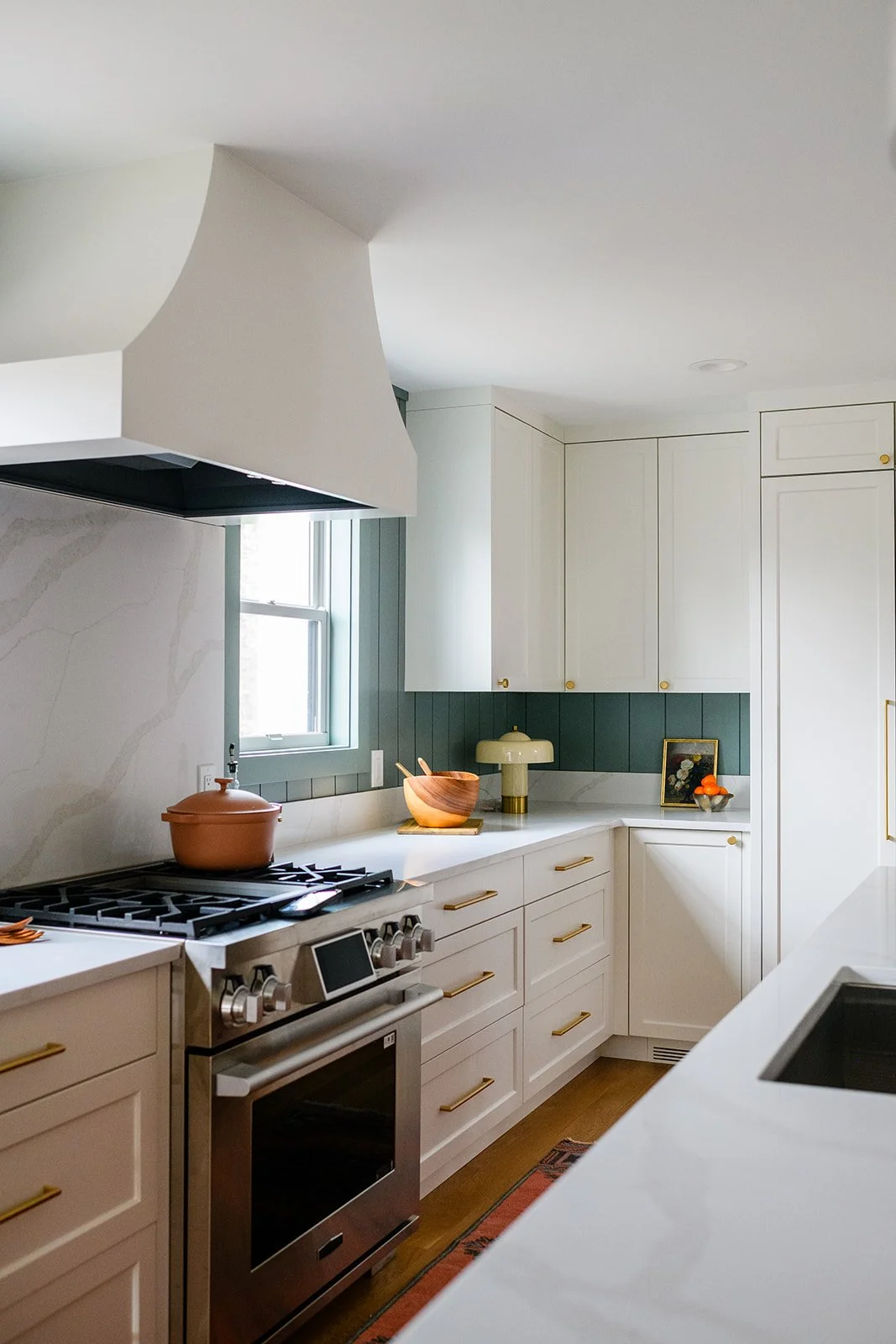
Cobalt and turquoise shades inject life into kitchens, family rooms, and creative spaces.
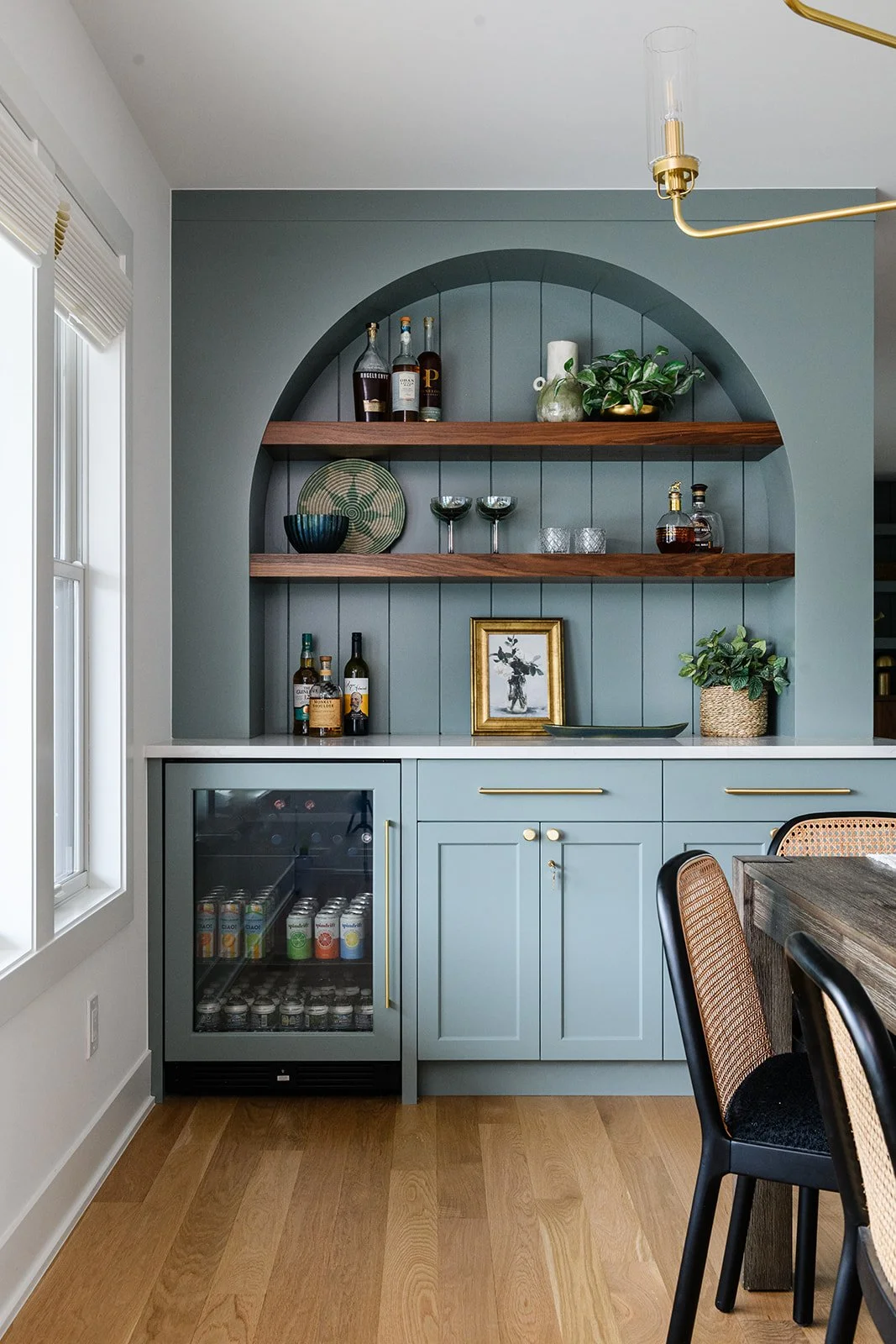
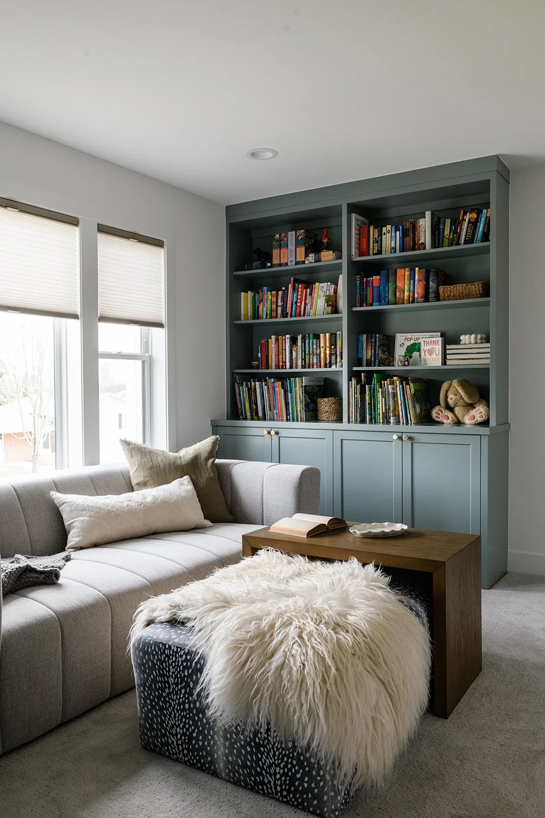
Blue-gray tones strike a balance between calm and sophistication. They're especially beautiful paired with warm wood tones and natural textures.
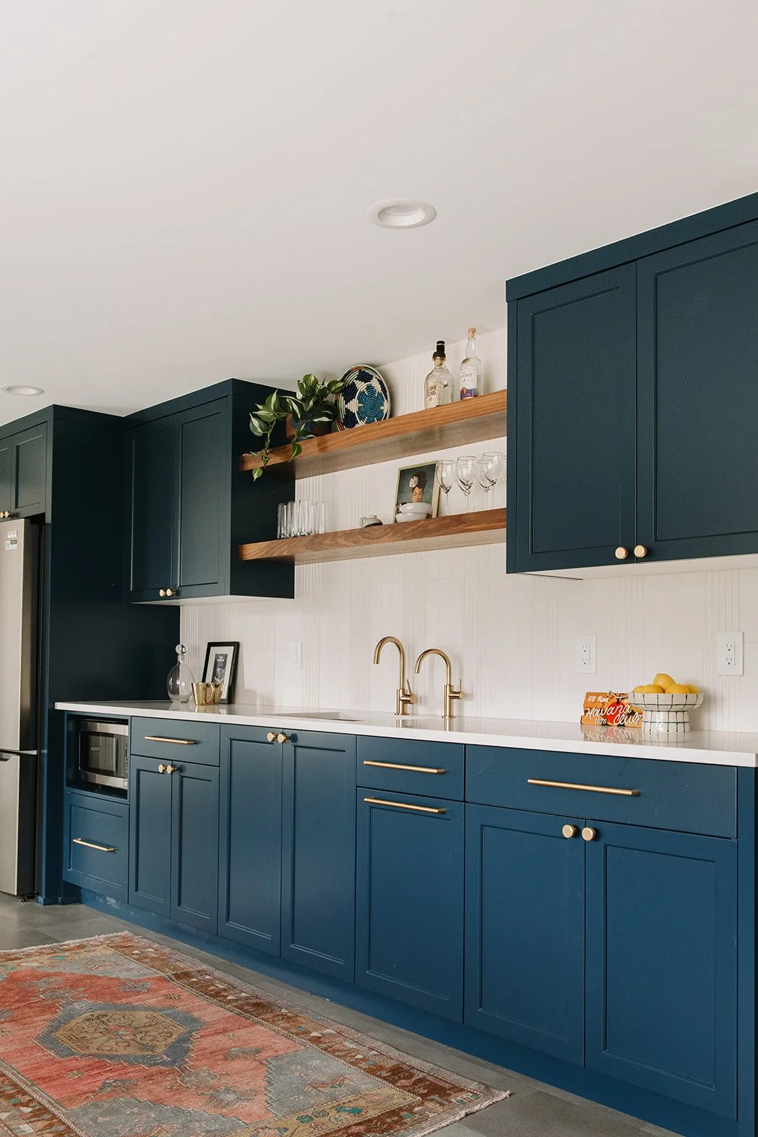
Navy works beautifully on built-ins, and pairs effortlessly with metallics and natural materials.
No matter the room or style there's a shade of blue that fits.
It Plays Well With Other Colors
One of the biggest design challenges is making colors work together, and blue is one of the most cooperative players on the wheel. The classic blue-and-white pairing is crisp and enduring, but blue also holds its own alongside bolder partners. It tames the brightness of orange, grounds the freshness of green, and adds depth next to jewel tones like fuschia. In more neutral schemes, it provides the one touch of color that keeps a room from feeling flat.
The key is balance. When leaning heavily into blue, especially in rooms with limited natural light or north-facing windows, pairing it with warm wood tones, soft textiles, or warm-toned lighting keeps the palette from feeling cold or cave-like. As with most things in design, the amount matters as much as the color itself.
It’s The Color Most People Already Love
Blue is the most universally beloved color on the planet, favored by roughly 45% of men and 35% of women. If you're designing a space that needs broad appeal, whether for a commercial project, a short-term rental, or just a household with different tastes, blue is your safest, most crowd-pleasing bet. The odds, genuinely, are in your favor. Blue is calming without being cold, versatile without being indecisive, and timeless without being boring.